


What The New Microsoft Office Gets Wrong:
Windows 8, the most radical redesign of Microsoft’s flagship operating system, is often said to be schizophrenic. On the one hand, the user interface that first greets users is beautiful: a fun, playful grid of colorful tiles, based on Microsoft’s well-received Metro design language, that offers access to apps and content. On the other hand, hidden beneath this Metro-enhanced surface is the same desktop-based UI we’ve known for decades, still riddled with taskbars, toolbars, and drop-down menus.Source: FastCoDesign
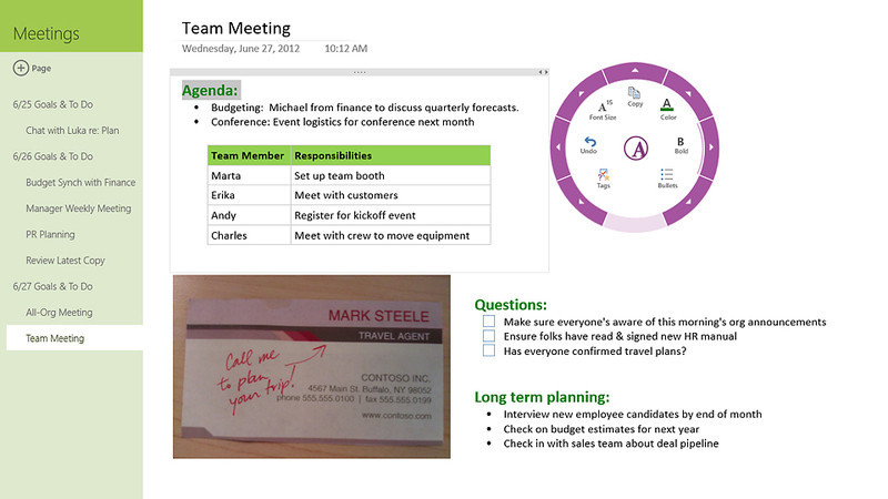
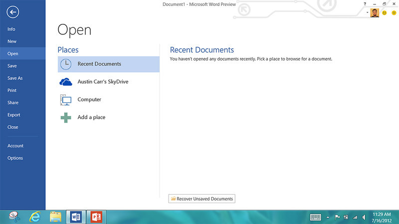
Today, Microsoft unveiled a preview of its latest version of Office, and like Windows 8, the newest iterations of Word, Excel, and PowerPoint are just as split-minded. With roughly one billion users worldwide, Microsoft faced the same issues designing Office as it did Windows: How do you re-imagine a ubiquitous piece of software without alienating your global user base? While Microsoft designed this latest release for mobile, engineering the experience for touch-screen devices, and infusing elements of Metro’s design language into the program, Office 15 still feels slightly dated—bogged down by decades of legacy.
No comments:
Post a Comment