Entertainment
Jesus, The Original Pirate
Gadgets
Using brainwaves to create 3D objects? It’s not science fiction, it’s just science
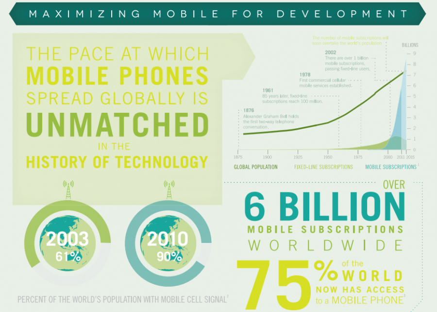
More People Have Cell Phones Than Toilets, U.N. Study Shows
Sony and E Ink are Making a Digital Paper Notepad and it Looks Awesome
The Stupidity of Smart TV
Why The Apple TV Has Nothing To Fear From The Xbox One