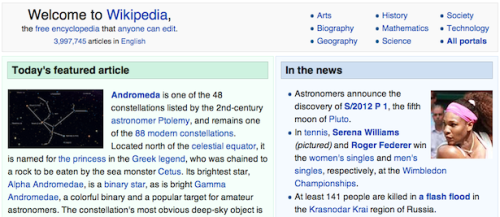
On the Ugliness of Wikipedia:
Here is an empirical truth about Wikipedia: Aesthetically, it is remarkably unattractive. The gridded layout! The disregard for mind-calming images! The vaguely Geocities-esque environment! Whether it’s ironic or fitting, it is undeniable: The Sum of All Human Knowledge, when actually summed up, is pretty ugly.Source: The Atlantic
And: no offense intended. Because, on the one hand, the site’s homeliness is a feature rather than a bug. “Wikipedia has always been kind of a homely, awkward, handcrafted-looking site,” says Sue Gardner, executive director of the Wikimedia Foundation. And that homeliness, she notes, “is part of its awkward charm.” Wikipedia’s just-rolled-out-of-bed-looking interface sends a clear message to users, Gardner said, in a panel at today’s Wikimania conference. And that message is, basically, that the site has better things to do than obsess about its appearance. Wikipedia “is clearly not designed — at all — by marketing people,” Gardner notes. “It is clearly not trying to sell you something.” Which means that Wikipedia’s frank, unpretentious interface serves as a subtle reassurance: The site is not trying to monetize you.
No comments:
Post a Comment